The Emotional Impact of Bad Design
Design can have an emotional impact on the end-user, be it happy, sad, frustrated or excluded. I explored why designs have an effect on us emotionally and to gain more knowledge and understanding as to what generates these feelings. Technology has become a normal part of our day-to-day lives and we often rely on it for even the simplest of tasks. We expect technology to have a positive impact, however, when a design causes our lives to become more difficult rather than simpler, then we can become frustrated. When we design we should use the best possible method to ensure the end-user has a positive interaction with the design.
We use social media to share memories with our friends and family that we can look back on and enjoy. However, what if a memory that at one point made us happy now impacts us in a negative way and provides a reminder of sadness rather than happiness? Facebook added a feature that shares various memories, such as pictures, that we previously uploaded or shared on the social media platform. Although this feature has its benefits it is important to consider the emotional impact that something may have on us.
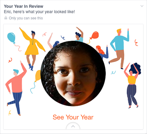
Eric Meyer wrote a blog post, Inadvertent Algorithmic Cruelty, that explains how in 2014, Facebook introduced a feature ‘Year in Review' that creates a video of all your most liked photos, videos, and statuses from the past year. This feature offered the chance for people to re-live happy memories, however, for Eric this was not the case. Unfortunately, in 2014 his daughter, Rebecca, passed away and upon opening Facebook the first thing he was presented with was an image of his deceased daughter surrounded by illustrations of balloons and people dancing in celebration. Eric had not chosen to create this video, it was automatically generated and shown without his consent, and even more frustrating it was not displayed clearly how to dismiss or hide this feature.
It is important that we understand although features may seem harmless and a nice gesture this isn't always the case. If you are adding a feature ensure that there is a clear way to remove or dismiss it. This is a small option to add that can have an enormous impact on the end-user.
When designing it is important to consider the limitations that an end-user may have, and the ways in which we can help people by ensuring that our designs are accessible. When a design excludes people they can feel frustrated and unconsidered. However, when we design with accessibility in mind we make sure that any user with a disability does not feel deprived of their independence. According to Tragic Design, 19% of the population has a disability and as designers it is our responsibility to consider disabilities and enable our software to be accessible to as many people as possible. Some designers feel that if we design for accessibility then we compromise the aesthetics. However, if we design for functionality in all aspects then we can produce something that is useful for the majority of people, rather than something that excludes a group of users and has nice aesthetics.
Ensuring that accessibility is prioritised allows us to positively impact people's lives and encourages us to move forward in enabling those with a disability to get the most out of technology. Furthermore, if you do not consider accessibility then it is possible that you could potentially be sued for discrimination. Don't Make Me Think explains that “Blind people with access to a computer can now read the daily newspaper on their own”. We can take for granted everything we are capable of and forget that others are not as fortunate. As designers we have the ability to dramatically change someone's life by making relatively minor alterations to our designs. Alternative text, contrasting colours and adding descriptions to hyperlinks are minor considerations that instantly improves how a user with a disability interacts with technology.
If you create a design that negatively impacts a user without intention, then you have failed to understand the user. However, some systems are designed with dark patterns that intentionally cause confusion, and trick the end user into doing something that they have not intended to do.
In dark UX, color theory is manipulated to misdirect, language is used to confuse rather than clarify, and the user is exploited to boost company reach or profits.
Cassandra Naji
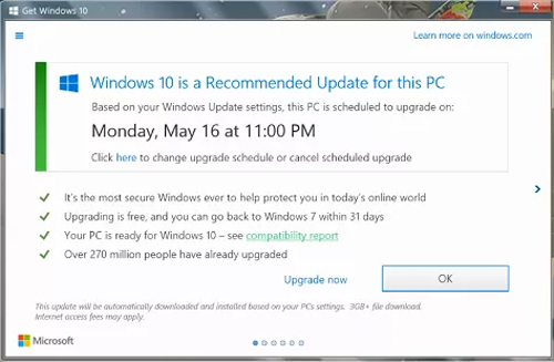
There are numerous types of dark patterns, one of which is called ‘Bait and Switch'. This is when a user clicks a button expecting a desired outcome, although the result is not what they had intended. Microsoft caused outrage with the Windows 10 upgrade giving the user two buttons, ‘Upgrade now' or ‘Upgrade tonight' the only other option was the close button. The issue with this was that the close button did not close the pop-up; instead it automatically started to download the upgrade. This outcome was not expected from the close button resulting in frustration and anger from users and has went as far as resulting in legal action against their invasive upgrade practices.
Another example is the ‘Roach Model', which works by pre-selecting additional purchases, or a monthly subscription, which you may not realise has been added until you have already paid for it. An example of this would be having a checkbox pre-selected for additional services, such as legal cover by an insurance company. Another way that this works is by making the end-user select the checkbox if they do not want the service. We commonly select a checkbox to say yes to something, therefore when it has to be selected for say no we have been misled.
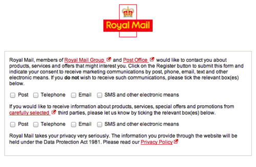
Alongside checkboxes, you can be met with ‘Trick Questions' that mislead you into selecting an option that you may not have intended to select. This happens when you glance at the question and think that it has asked one thing, although, once you read it carefully you notice that the question they have asked is something entirely different. An example of this is being presented with the option to opt out of being contacted with various checkboxes for by text, by post or by email. That question naturally feels like it is asking you ways that you would like to be contacted, therefore deceiving the end-user. This particular dark pattern works as according to the Nielsen Norman Group we only read 20% of the text on a webpage, therefore we do not pick up on misleading questions.
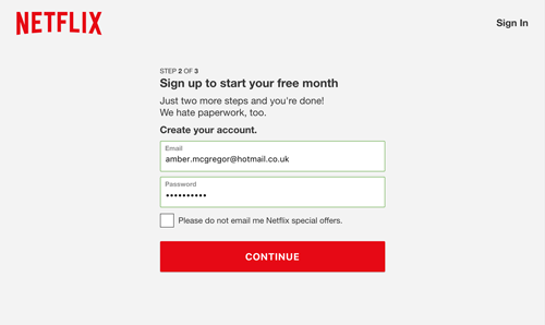
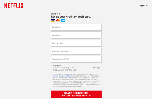
Companies have the motivation to use dark patterns to aid their growth and sales, meaning that the end-user suffers at the hands of bad business tactics. ‘Forced Continuity' is a tactic when you take out a free trial and are required to enter your credit or debit card details to get access to a trail. Once your trial expires you are not given any notice or reminders before your card has been charged for a service that you never intended to sign up for. An example of this is Netflix offering a free month that is advertised clearly at the top of a form, which also requests that you enter your card or PayPal details. The small print along the bottom states that if you do not cancel within the one-month free trial you will automatically be charged for the service. You are being provided with the information that you will be charged for the account, however, you are not sent a reminder that you are going to be charged for the account. This results in many people forgetting that they have signed up and being charged for a service that they may not want.
Although you are being provided with information that you are going to be charged for a service it is important that you remind the end-user that their free trial is coming to an end and they will be charged for the service once the trial expires. Forced continuity works as many of us can easily forget that we signed up for a free trial. By the time we realise we have already been charged for maybe several months for the service.
Dark patterns result in the end user having a negative association with a company, alongside being frustrated due to being misled deliberately. Although profit was made through misdirection, ultimately you will lose customer's trust resulting in a loss in the long-term. We should never attempt to deceive a user into a product or service as a business tactic. It is important that you give customers clear information and do not deceive them in a bid to make money. Customer satisfaction and a positive relationship with a company will be more beneficial in the long run. Dark patterns trick people into behaving the way that a company desires through deceptive tactics. Good user experiences allow customers to use a company because they offer them a good experience and a positive association with that company.
© Written & Designed by Amber McGregor