Introduction
The technologies that we develop and use transform our lives on a daily basis, from making communication easier between one another to giving us the ability to save lives. However, what happens when the technology we have designed and that we rely on every day to make our lives better takes a life? As designers, we aim to create products that are aesthetically pleasing and function as intended. Nevertheless, many designs seem to neglect the functionality and focus on the aesthetics. This essay will explain how powerful design is, and how we as designers have a certain degree of responsibility to ensure that functionality is made the priority in the design process.
Life-changing and lifesaving, technologies are relied on by millions of people every day. However, the same technologies can result in life-threatening implications if they have not been designed with their intended user at the centre of the design process. I want to delve into how various designs have failed to serve their purpose, as well as the consequences of these failures. I want to demonstrate on how a properly thought out design that functions at a high level is pivotal to ensuring a safe, usable design, and how as designers we should strive to prioritise functionality first, and aesthetics after.
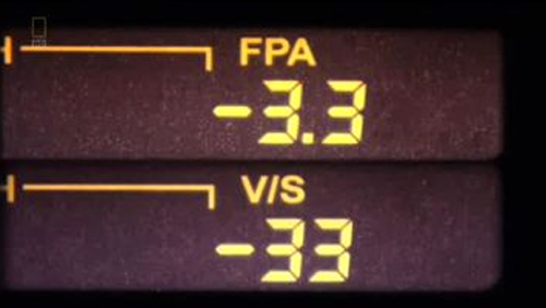
On 20th January 1992, a tragic incident happened due to a thoughtless design that took the lives of eighty-seven people. Two skilled pilots with over 12,000 hours of flying experience between them were travelling to Strasbourg, Germany when adverse weather conditions caused interruptions with the flight's scheduled course. With their joint experience they calculated that a descent of 3.3 degrees would safely align them with the runway. Unfortunately once the clouds broke the pilots came face-to-face with a mountain and seconds later the horrific collision occurred, only nine people survived. An investigation into how this accident occurred showed that the interface the pilots used to enter information was to blame. The reason that it was difficult to grasp what data was being entered was due to the same screen handled two pieces of key information – Flight Path Angle (FPA) and Vertical Speed (VS). Rather than enter -3.3 for the Flight Path Angle the pilot entered -3,300ft/min for the Vertical Speed. The small interface and the only difference being a missing decimal point robbed people of their lives. This could have easily have been avoided if the interface was more carefully considered. When we design it is vital to understand that unclear information can lead to catastrophic incidents.

Throughout this essay, I will explore how illogical designs have resulted in a number of life-threatening issues and investigate the devastation surrounding the failures of designs that are not intuitive. I will explain how we as designers can end up producing something unusable in conjunction with how shortcuts taken during user testing in the overall design process can result in the loss of life. I believe that if we as designers can understand how these failures happened we could prevent serious incidents from reoccurring in the future, we have the ability to improve – as well as save - lives through our designs.
© Written & Designed by Amber McGregor