When Bad Design Has Fatal Consequences
When we design a system or a product that is meant to help people, we believe that our work is having a positive impact. However, what happens when a design is the reason that someone loses his or her life? I began to research the various times that unusable design has resulted in fatal consequences, and how as designers we have a level of responsibility to ensure that our end-users are kept safe.
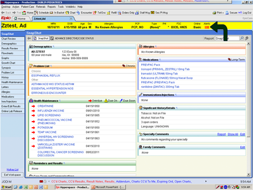
The first chapter of Tragic Design explains how a user interface resulted in a young girl, Jenny, dying from toxicity and dehydration. This devastating story explains the true impact of bad design and how it can have deadly implications. This dreadful incident happened when nurses trying to use the new system were faced with information overload, causing confusion. The most important information was concealed making it difficult to find, therefore the correct course of treatment was not given to Jenny, resulting in her death.
When we design an interface we can be tasked with placing a vast amount of information on a small device or screen. It is important that as designers we understand the information that should be prioritised, and display this information in such a way it is easily accessed and seen clearly by the end-user. Jenny lost her life due to this very reason. The life-saving information was not easy to see, resulting in it being unnoticed. This resulted in her not receiving the essential care she needed and she sadly lost her life.
The hospital staff had been supplied with a system that displayed a vast amount of information, making it overwhelming and difficult to navigate. The alerts were not clear to see, and attention was not drawn to them meaning that life-saving opportunities were missed. One of the key takeaways of this chapter in Tragic Design states a “good visual design reduces the cognitive load required to complete a task”. It is clear looking at the interface that if more attention and thought had been put into the design, and emphasis placed on particular areas of the interface, then maybe a life would have been saved.

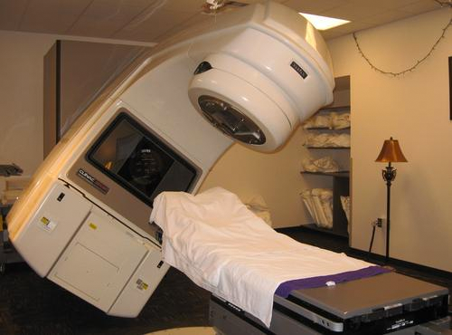
Jenny's death is not an isolated incident as medical technologies have experienced various failures that have resulted in the unfortunate deaths of patients. The Therac-25 is a radiotherapy machine that works by delivering safe doses through an electron, or x-ray, beam. This technology is used during cancer treatments, or to kill malignant cells. This machine was designed to save lives, however, between 1985 and 1987 six incidents occurred resulting in substantial overdoses being given to patients. As a result of these incidents, three patients died due to their injuries and others were seriously harmed.

The Therac-25 worked by the operator entering the prescribed dose and the mode to be administered by the machine. However, the incidents occurred when the machine would blast the patient with drastically more rad, radiation Absorbed Dose, than required. The dose surpassed 17,000 rad when the normal dose was merely 200. This resulted in excruciating pain for the patient. It was that severe that one patient leapt from the operating table and ran to the exit of the room. Even more alarming is the fact that 1,000 rad over a person's entire body is deemed fatal; therefore the impact of a staggering 17,000 in an area as small as a penny has devastating implications. Burn marks and rashes appeared on the patient's body within 24 hours of the incident, and over a few weeks, the wound would gradually get worse, developing into a large hole that resembled a gunshot wound.
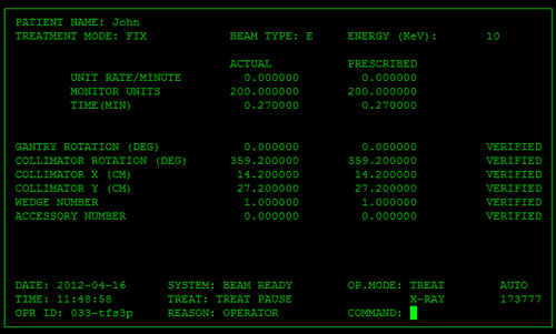
There are numerous issues that contributed to the failure of Thermac-25, and the interface design played a role in these failings. The interface worked on a command line structure which was controlled using the arrows on the keyboard, rather than a mouse. The first step for the operator was to input the mode, which could have been either “e” for electron or “x” for x-ray, then the operator moved onto the next field. The issue occurred when the operator then realised that they had entered the wrong mode and needed to change it, resulting in them pressing the up arrow on the keyboard. However, the up arrow did not move back to the previous fields, instead, it entered the string of characters that represented the up arrow. The interface had a major failing by not communicating with the end-user about what was going on, and not clearly displaying the field they are typing into and what exactly they are typing.

The lack of end-user feedback caused uncertainty when an error message was displayed that stated; “Malfunction 54” which is not enough information for the operator to know what the problem was. Error messages could be overwritten by pressing the “p” key, therefore meaning that errors were simply suppressed and as a result, a deadly dose of 15,000- 16,000 rad was given to the patient. A few weeks after this incident occurred the patient returned the hospital spitting blood and was diagnosed with radiation exposure. This resulted in his left arm, legs, vocal cords and diaphragm being paralyzed. Five months later he died. This incident was easily avoidable if the end-user had been provided with error messages that explained the problem. Providing them with immediate feedback that highlighted the error would have meant that they may not have dismissed the message without question. There would have been the opportunity to be aware of the situation and to have taken the appropriate action to address the problem.
One of the most alarming issues with the way the Thermac-25 was designed is that it automatically inserted default values. This may be acceptable in some cases to prevent the likelihood of errors, however, dealing with people's lives and a machine that is administering radiation is not a time when a default value should be used. To make the situation even more frightening the default values were not displayed for the operator to see making this feature a disaster waiting to happen.
The numerous and catastrophic incidents that occurred surrounding the Thermac-25 could have been avoided if more resources were put into user testing. The importance of end-user testing allows you to understand the issues that people are experiencing with the technologies and prevent them from having disastrous effects. Shariat explains, “When it comes to medical interfaces, testing with real users in realistic scenarios is not optional ”. User testing could have brought issues to light and inevitably saved lives in the process.
As designers, we need to understand that we have a role to play in safeguarding people that rely on our designs. We need to recognise that a bad design can be dangerous and do everything we can to prevent our work putting someone's life in danger. As designers, we can often neglect functionality and focus on the aesthetics resulting in a design that is unusable, and not functional. Emphasis needs to be placed on the importance of designing an interface that works and works to a high level. Once a functional design is in place, you can then focus on the aesthetics. When we design something that functions, then we design something that has a purpose. In the case of the interface that killed Jenny the alerts had of been clearer, and the interface less crowded then a death could have been avoided. The devastation around the Thermac-25 could have been prevented if the interface had given adequate feedback to the operator and did not set default values. Minor changes in the designs could have prevented needless deaths.
© Written & Designed by Amber McGregor