
Improvements Matter
Small changes can greatly impact the usability of a product. Below I have explained some of the changes that I was involved in to improve the usability of an eCommerce platform.
Small changes can greatly impact the usability of a product. Below I have explained some of the changes that I was involved in to improve the usability of an eCommerce platform.
I was in charge of reviewing the current UI and the usability of the platform to see what improvements needed to be made to make it more appealing and usable by our customers. The original platform was designed for MVP purposes and had not had a lot of design input. I worked alongside a front-end developer to redo the UI and bring it in line with the brand and improve the common processes that our customers would do regularly.
🗺️
Customer Journeys
📋
Reviewing Feedback
👩💻
UX & UI Design
✅
Front-end Reviews
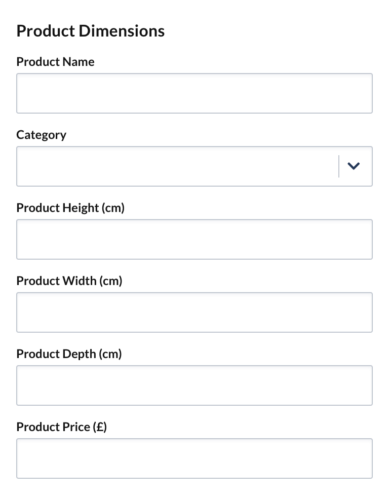
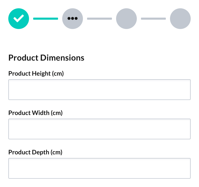
Due to the nature of the business, a lot of information needs to be captured in forms. The issue was that all form fields would be on the one page, some being in the access of 15 questions. For our customers, this was overwhelming and often confusing as the questions would relate to different things.
Wizards were implemented to break down large quantities of questions into smaller more manageable chunks that helped make sense of what was being asked and reduced the cognitive load. This improvement helped to make logic of forms and was a great help when larger features were added.
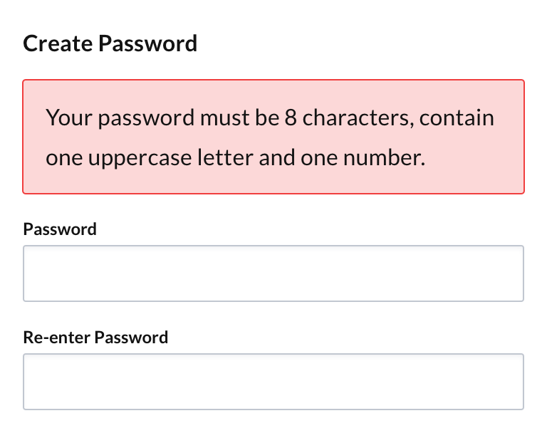
For security reasons often there are criteria for passwords and certain information within forms is mandatory. However, the issue was that users would only be informed after they did not meet those criteria. One of the most frustrating places was creating a password. To ensure that our customers had used a strong password we required it to contain at least 8 characters, one number, and one special character.
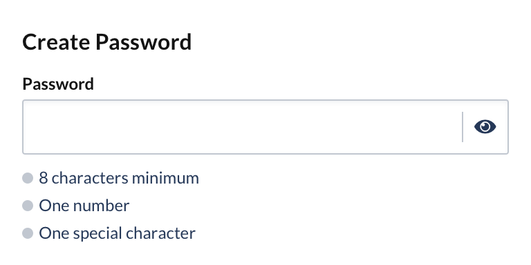
Rather than require our customers to enter a password then be told after that they did not meet the criteria a responsive system was implemented that showed the user that they had met the criteria as they created their password. After research, it was decided to also remove the re-enter password field and instead offer a show hide toggle on the password field that allowed customers to visually see their password.
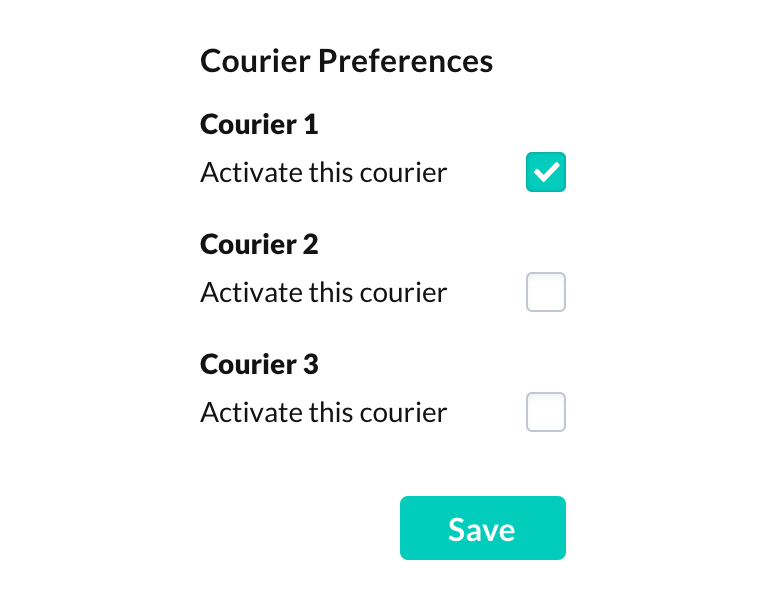
Originally there were a lot of checkboxes to activate couriers that you needed to save before continuing. The issue was that these checkboxes and the save button always displayed on the couriers' page, with no feedback that you needed to save when you made changes.
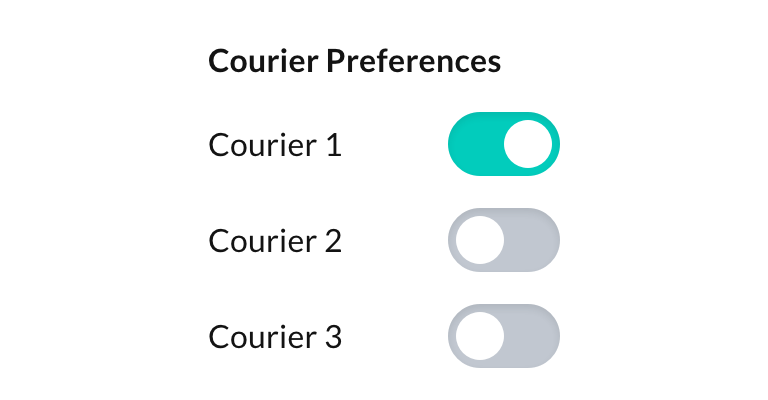
We decided that the couriers are turned on and off similar to a light switch. If they are always displayed on the page it would be best to toggles that would not require the user to save for the changes to be made.
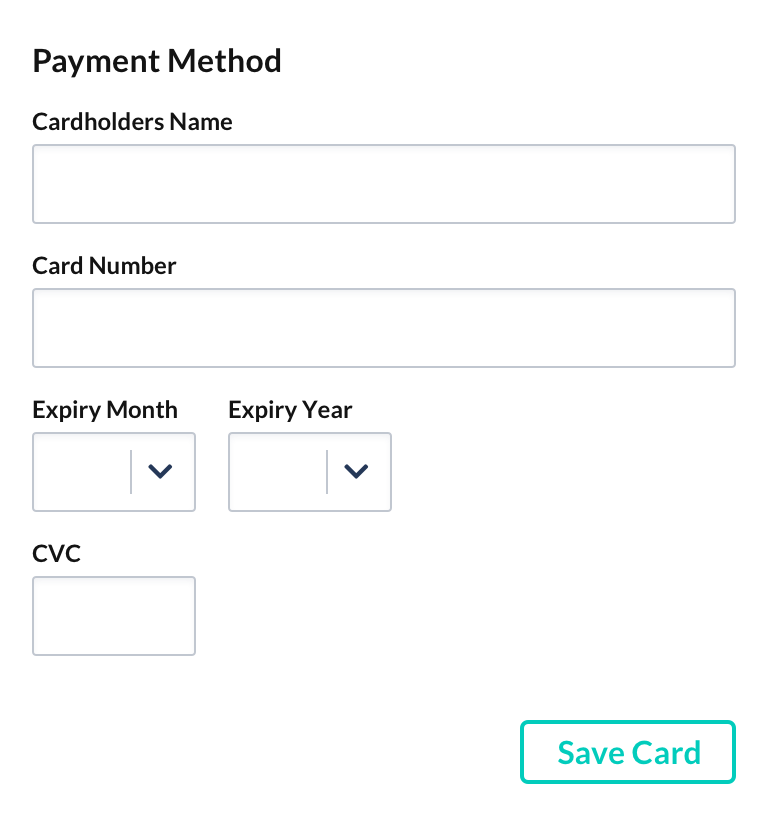
Once a card was added to the account you would not be able to see it. The payment page would only show a form to add a new card. The issue was it was difficult for customers to know what card they added to the account. This meant that all the customers could do is enter the card details and replace the card on the system.
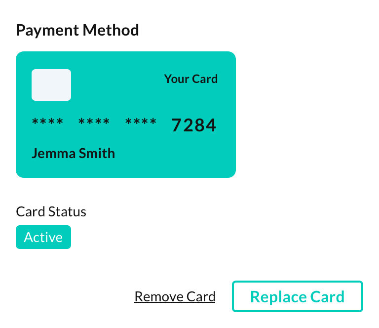
We needed to display information that the customer would need, such as the card on file and the status of the card. Currently, if a card becomes invalid, if it was canceled, for example, they would only know when we contacted them. Now they can check the card on file and see the status of the card. They can also remove the card and replace it. This way they are informed and know what actions they can take on the payments page.
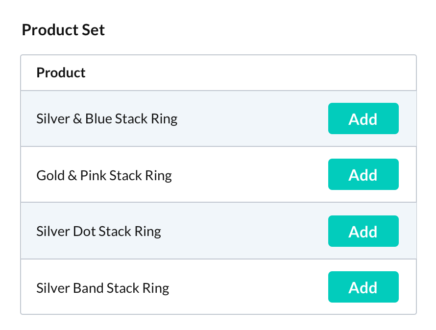
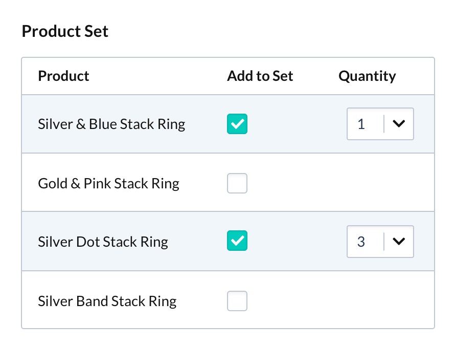
Often our customers need to get a lot done in a short space of time. They want to get tasks completed efficiently and with ease. Originally tasks had been designed with modals to add quantities. However, once reviewing how the system was used it became apparent that an easier way needed to be implemented.
A table with the ability to add products and the quantity sped up processes for our customers. We added search functionality that allows people to find what they need quickly and easily to reduce the amount of time they need to spend completing a task.
Even minor changes can increase the usability of a product. Considerations for how customers interact with a product when designing are pivotal for creating a product that helps, rather than costs them time. Re-designing the portal was recognised by customers and the feedback was extremely positive. From it looking more professional to it being easier to use.
Obviously not every design decision is perfect and by continually re-evaluating we can add improvements that help our customers with the day-to-day running of their business.