Our Place
Our Place is a native app that makes buying or renting a house together simplier.
Work in progress...
Our Place is a native app that makes buying or renting a house together simplier.
Work in progress...
Our Place makes buying a house as a couple easier. Finding properties that everyone agrees with can be challenging and add stress to the situation. Our Place works by matching properties that whoevever involved agrees with.
Buying a house can be stressful. Trying to find a location, the most important things for the house to have and on top of that buying with someone means that you have to agree on what you both want together.
🏘️
1.180million
house sales in 2019👨👩
29 years old
is the average age of a first time buyer🏠
3 homes
is the average people buy in a lifetime🥇
365,000
first-time buyers in 2019I held interviews with people searching for a home, first-time buyers and movers, and then I spoke to people who bought a house and the issues they had searching. Getting an insight into the problems that people had allowed me to see the features that would be best to design. I also ran a survey to get insight into the most important things for a house to have for buyers.
“Buying a house is exciting, but stressful. It is hard to get a clear idea on what is important to both people. Houses you like get lost in messages, Facebook posts or even what family show you. It can be frustrating.”
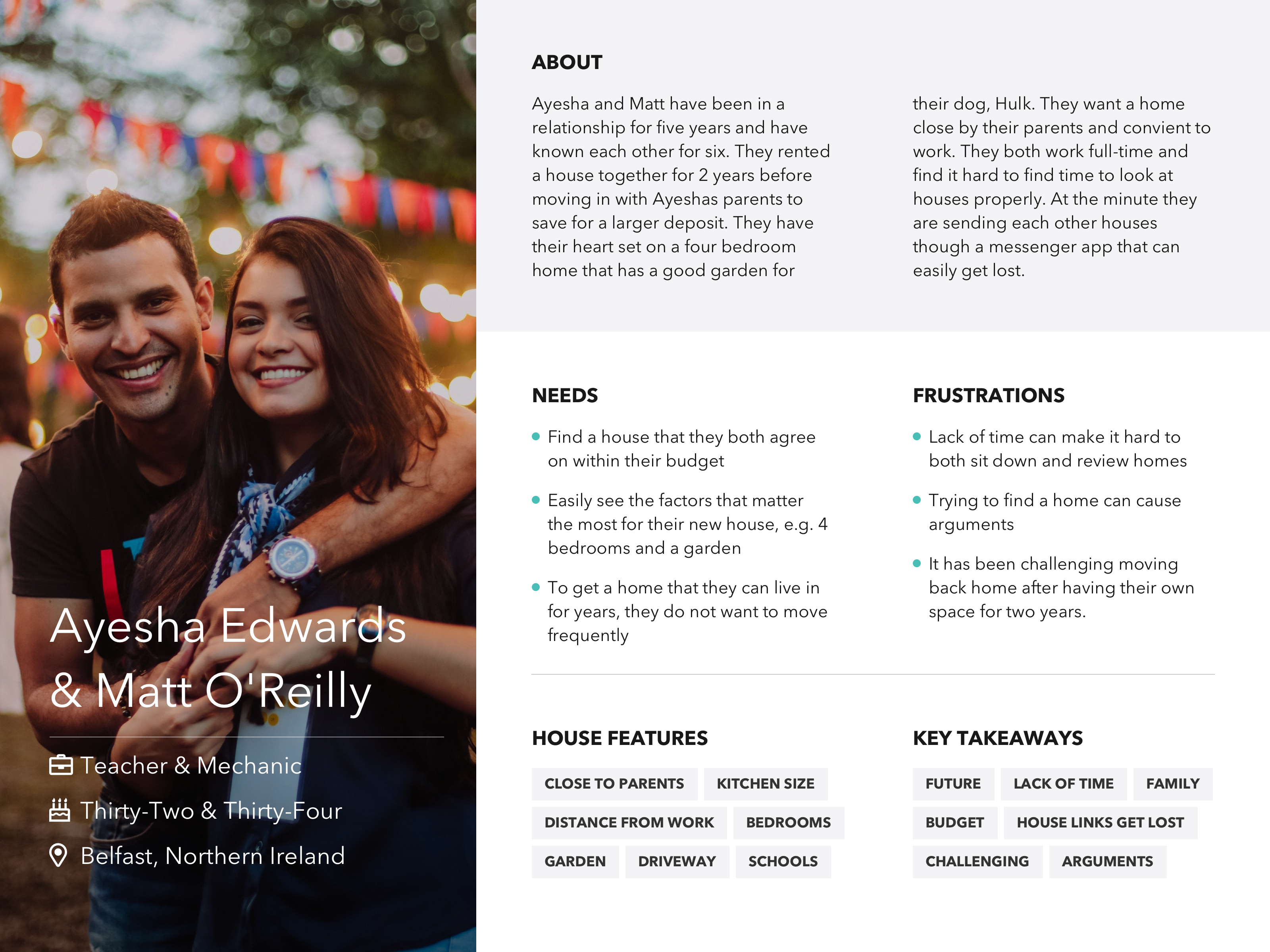
After completing user research I created a persona based on my findings.

🎯
The target age group is 28-40👫
Couples buying a home together💸
Couples ready to buy✅
People who have a criteria for a homeAfter researching the issues that home buyers had and the bigggest problem areas I came up with a feature list that would solve the issues at hand.
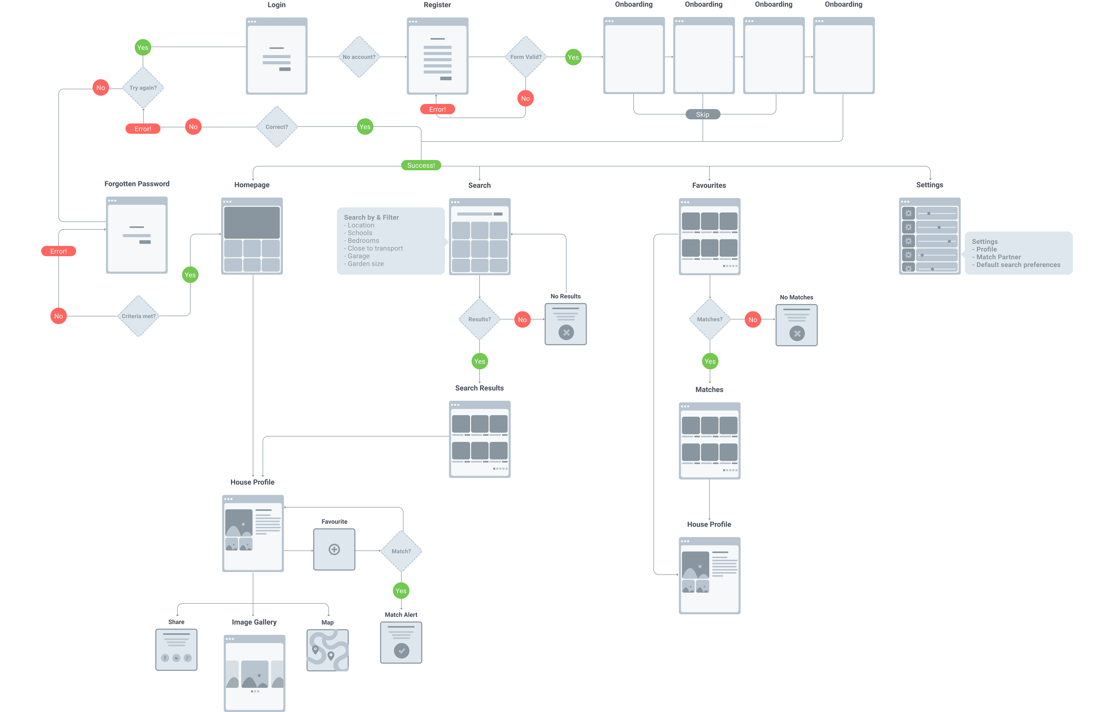
I wanted to plan how the app should work before I started to design.

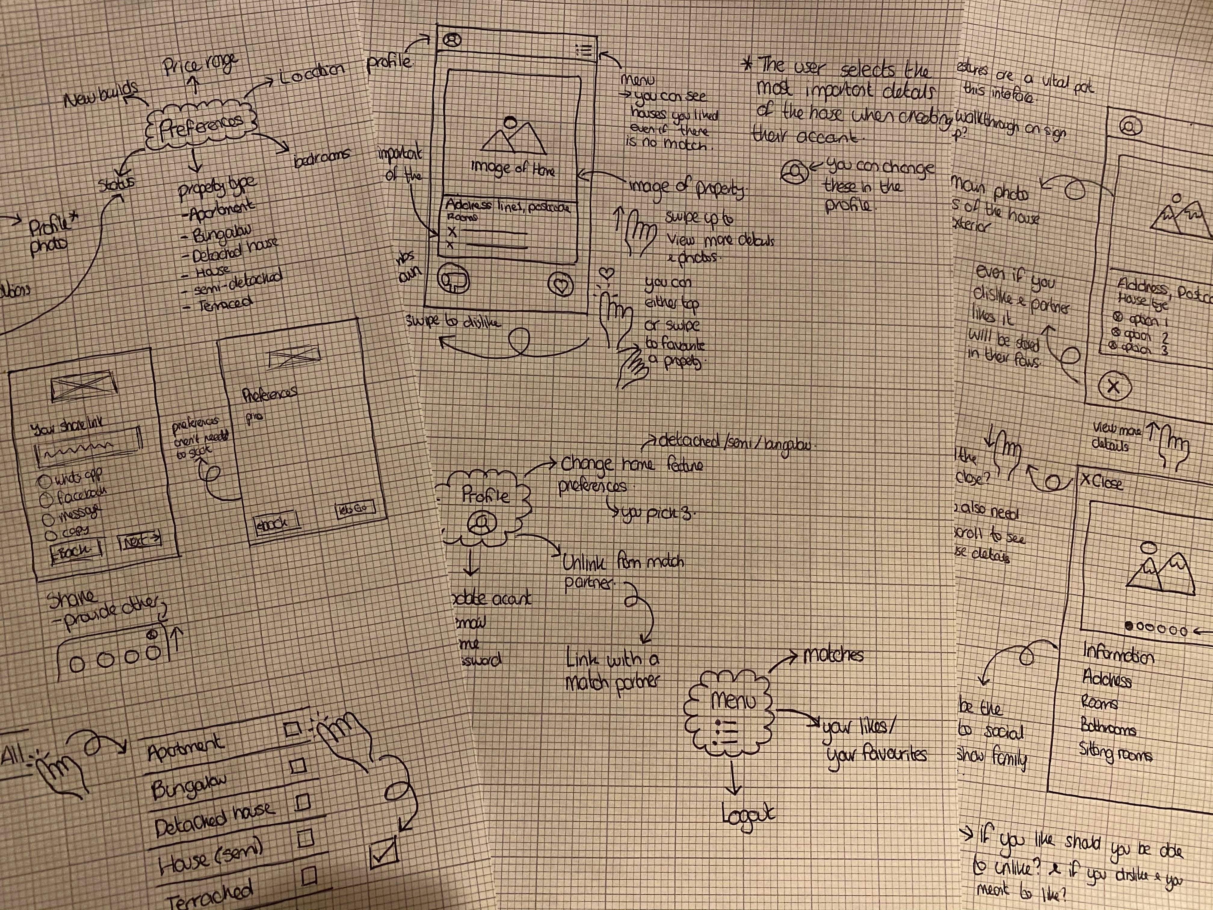
Once I had gathered information on what people look for in a house and the common problems that people have buying a house together I started to sketch out some ideas. I researched into estate agent websites, shopping websites for filtering and menues and looked at Tinder, Bumble and a baby naming app for ideas on how swiping could work for the UI.

Wireframes pending...
I created my designs using Sketch for an iPhone 8 Plus. I opted for this device as when I spoke to people they commonly had iPhones and this allowed me to test on my own device. I created this prototype using Figma and used the time to learn more about the interaction feature. I wanted to create a prototype that allowed me to see how the interaction of liking, disliking or viewing a home would behave.
Pending...