
Abunci
Good food should be for everyone, Abunci is an iOS app that allows you to search for restaurants that suits your dietary needs.

Good food should be for everyone, Abunci is an iOS app that allows you to search for restaurants that suits your dietary needs.
Abunci makes it easier for people who have a specific dietary requirement, or even multiple, to dine out with ease. The ability to search for reviews based on specific needs and reduce the menu to display what they can safely eat. No worrying about the menu, no stressing about not being able to eat.
I started to think of how much easier it would be to travel with a dietary requirement if there was a specific app suited to my needs. I found ones for vegetarians and vegans specifically. However, what happens if you are vegetarian and lactose intolerant?
I travel a lot and before I go I need to spend time searching for restaurants and then searching the reviews for gluten-free. This process was tiring and I thought I cannot be the only one frustrated by this! Turns out when I spoke to others I was not the only one with this issue.
When you have a food allergy or intolerance it can be difficult to source a restaurant that you can eat in without worry. Another issue is with people who have a dietary requirement due to religious reasons or personal beliefs.
🥛
5 in 100
people are Lactose Intolerant🍞
1 in 100
people are Coeliac🍽️
10 in 100
people say they have a dietary sensitivity🥬
23 in 100
will be Vegetarian or Vegan by 2023To better gain an understanding of what users needed to make informed choices I carried out an online survey on people's dietary needs. Once I got data to work with I started to piece together consistencies to see the main issues that users would have to allow me to focus on the areas that would offer the greatest benefit.
After researching dietary needs and how things are progressing regarding different lifestyles and medically required diets I created user personas based on the users and their needs.
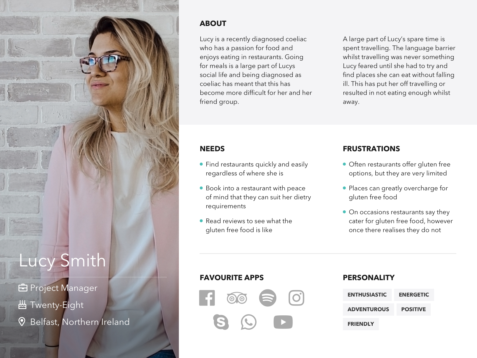
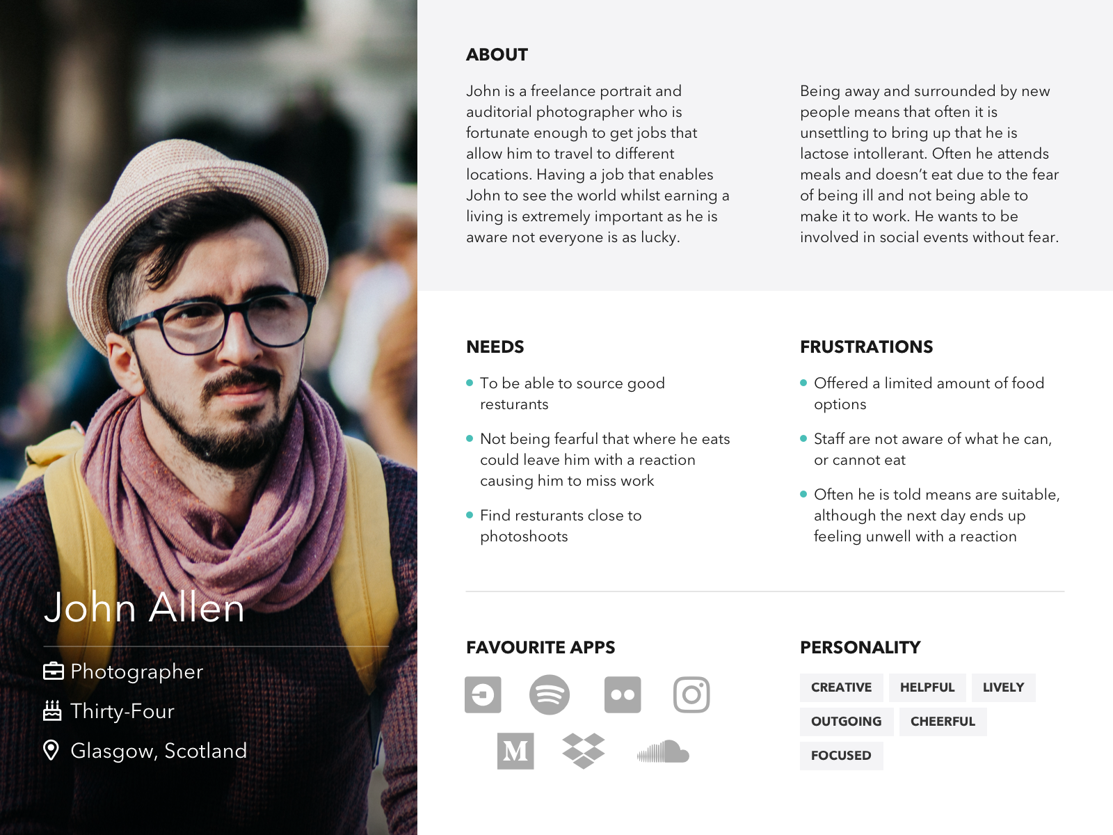
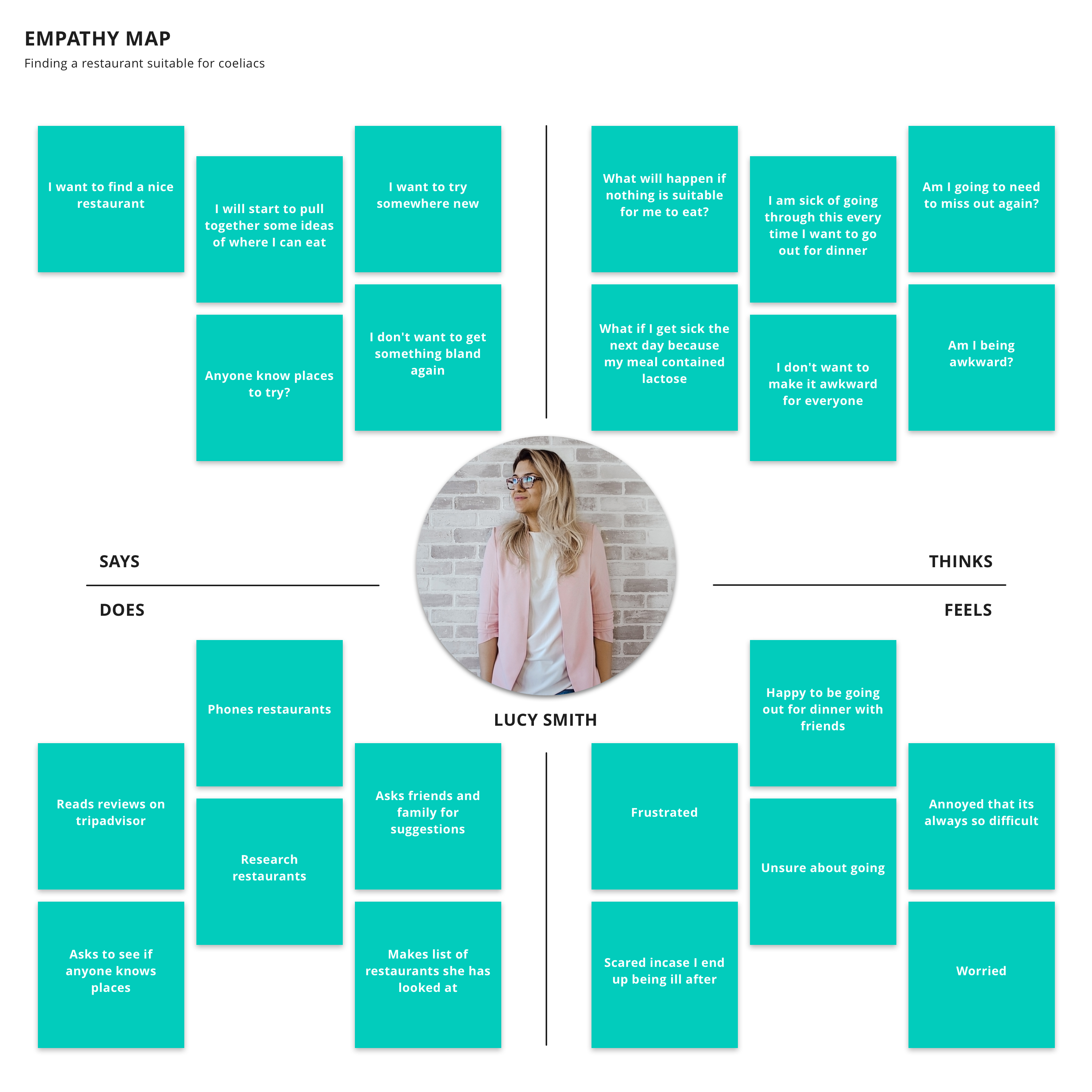
I wanted to gain a better understanding of the target audience and better understand the emotions and issues that they face.
🎯
The target age group is 18 to 34🕌
People with a diet based on Religion💳
People with a disposable income🍴
Frequent dinners and foodiesAfter researching the issues that people had I wanted to create a solution that was not solely controlled by the restaurant itself. The main influence for this was that numerous people who kindly answered my questionnaire said that they had been told meals are suitable. However, when they arrived they had little or no choice at all.
There was a lot of information needed from the user to allow an account to be created that enabled the personalised experience that I desired. I wanted to find a way to allow onboarding to ask all the questions necessary without the user getting frustrated.p>
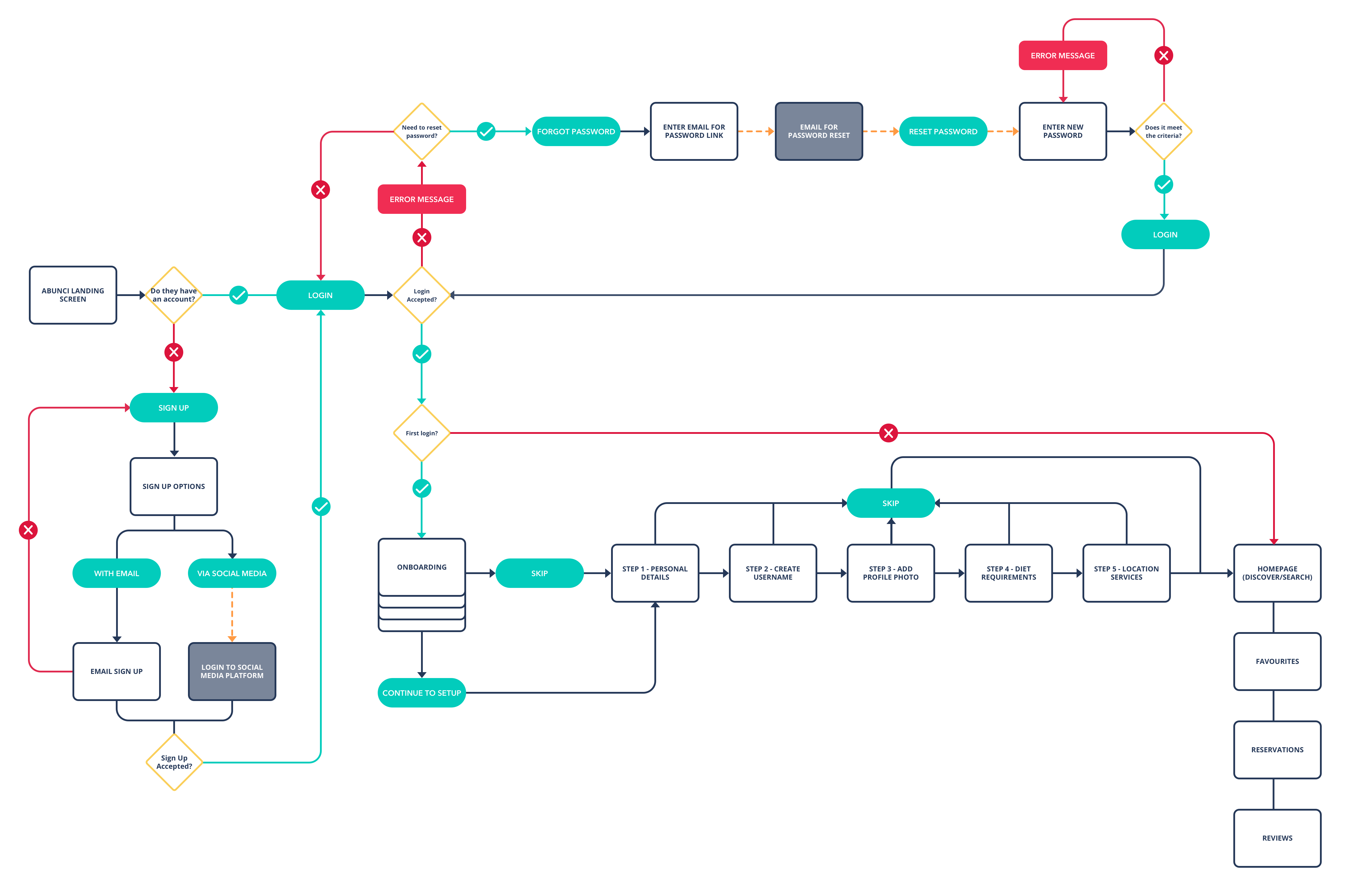
I find it easier to try and visualise my idea by sketching it and the different features and ways that I think they should work and react when the end user interacts with them. Sketching ideas makes it easier for me to begin to create an idea of how the user will find their way around the app and how navigation should be. Once I begin to sketch my ideas I start to notice things that I might have forgot which I can refine going into lo-fi designs.
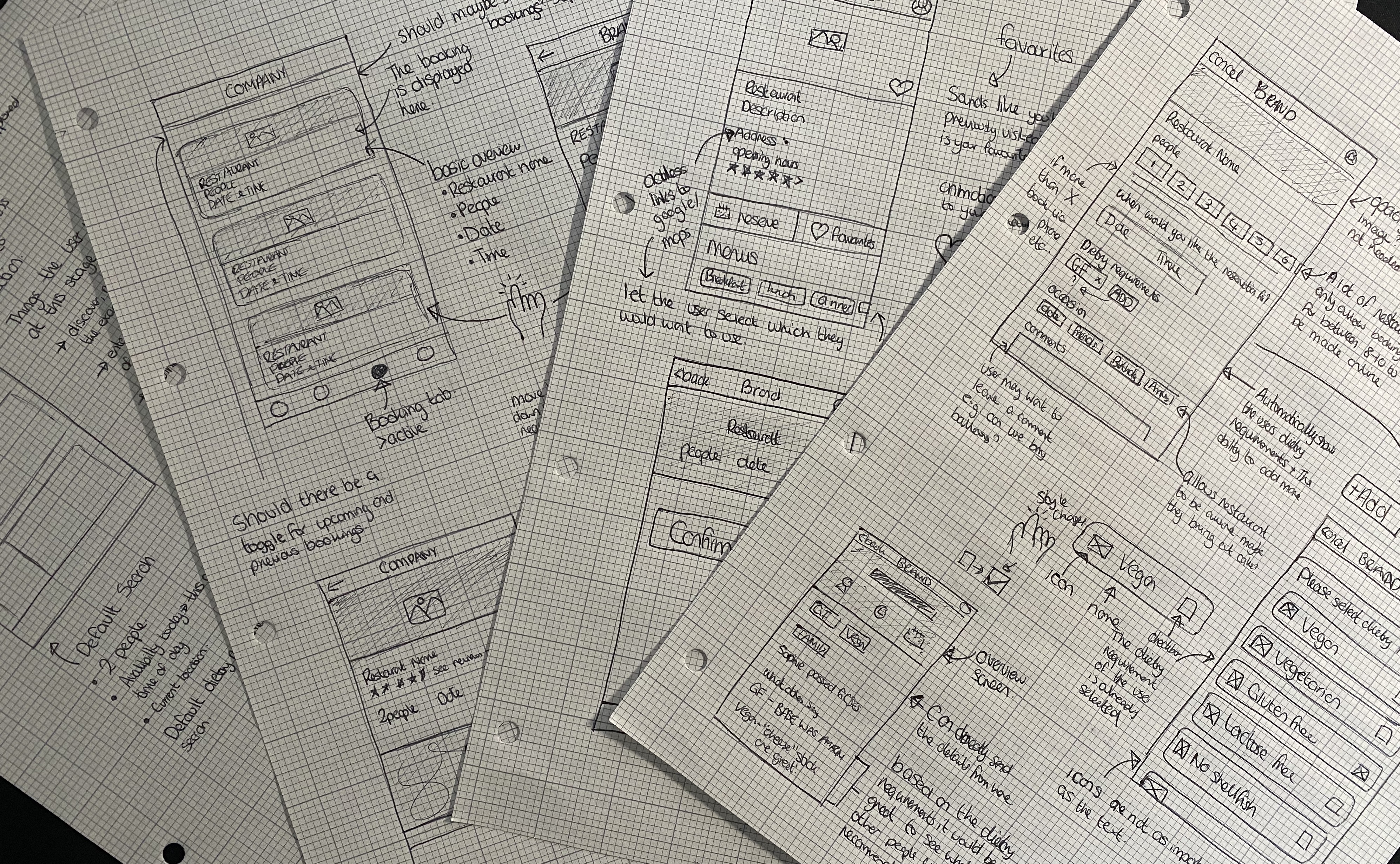
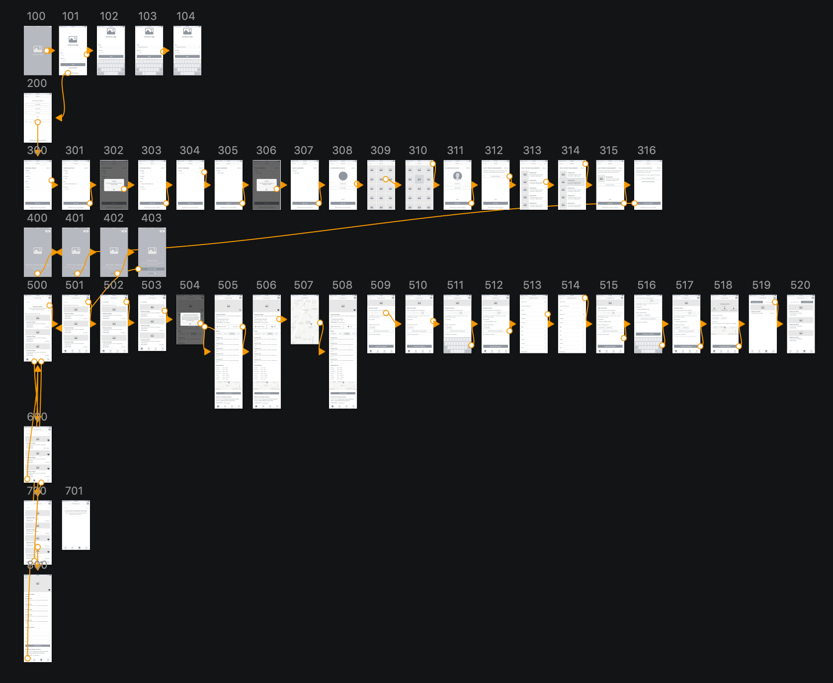
Once I had sketched ideas and had a clearer idea on what the app layout and navigation could be I started to create a lo-fi wireframe to create a clear struture and plan of how to go forward with the app. I altered these to get a better structure and altered the layout to accomodate the features I had planned for. I uploaded some of the lo-fi wireframes to Sketch Cloud to see my thought process.
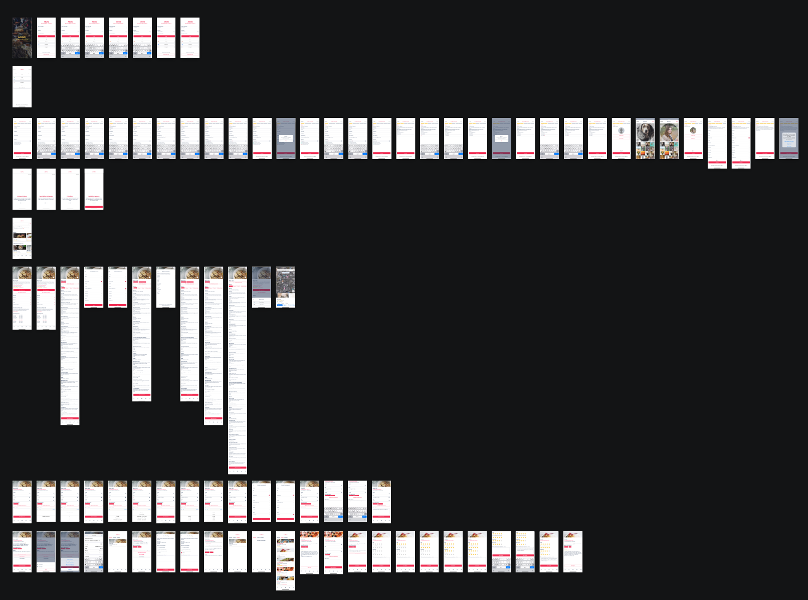
I created my designs using Sketch for an iPhone 8 Plus. I opted for this device as when I spoke to people they commonly had iPhones and this allowed me to test on my own device. You can see the InVision hi-fi designs.
I feel that Abunci would be a good tool for those with a dietary requirement. It offers the features that after speaking to the people impacted by dietary requirements required the most. If I was to spend more time on this I would focus more on the ratings feature to allow people to find reviews easier based on their needs.
It would also be good to look at showing the times that restaurants are busy and a way to advice users to book in advance as they are often full on specific nights and times.